Essential Web Design Tips For Kid’s Bedtime Story Website
With so many websites, bogs and activities on the Arab cyber sphere targeting men, women, teenagers, and people in their 20’s people in their thirties, there’s hardly any genre left! However, there is some truth in the fact that there is little being done to enhance the experience of children over the web other than through video games and movies!
Imagine a bedtime story website for children present over the World Wide Web that lets kids read before they go to sleep! Children can access the site and read through the books whenever they like! Life made easy for Emirati parents.

All you need are a few good ideas and experts in best website design company to get the job done for you! Read on to know how essential tips for designing a bedtime story website for kids who love stories!
Essential design tips for kid’s website
Website design is essential for all websites. However, website design elements become critical when it's a children’s website being designed. Children may be of different ages, and may have a variable understanding of what's written in the text, however, considering their short attention span it’s important to incorporate essential tips in the website design to keep children interested:
Typography
The typography on the site pages should be clear and easy to comprehend by the little ones. Since children do not have well-developed reading skills, typography plays an essential role in keeping the design intact!
In addition, keep the typography palette simple. Stick to a single or two typefaces. The style you choose shouldn’t have variations either. Since its just children going through the site, there is no need for elaborate effects. The color of the text should stand in contrast with the background.
If the background is lighter opt for darker text, and when your background is darker choose for lighter text. The ideal size for the text used should be about 14 pts. Any smaller and it's going to be impossible to read! For children who are a little too small (less than 8) use larger sizes.
Language
There's no need to include complicated sentences and words on the site. Opt instead for age-appropriate language. The simpler the language, the easier it is for children to understand. Generally speaking, children respond best to single strong words!
Moreover, the use of pictures and images should be more dominant than the use of text. More straightforward sentences are plausible options for children who are growing up. Avoid using long paragraphs for the content of the site.
Incorporate games
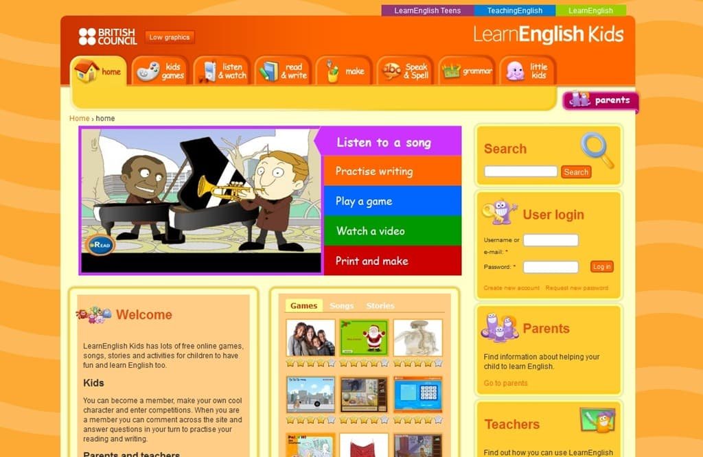
To make the site more fun and interactive and to get more kids to visit, opt for simple games on the site! Whether it’s a simple coloring exercise or a clickable route, children are extremely fond of games. Since its children who will be playing, ensure that the games included are age appropriate. Include them as a time out for children!
Include animations
Children simply love animated movies. You can also incorporate animations in the site as a way to attract more and more children to the site and to keep them occupied. Incorporate features that allow kids to design their own characters.
Color
Last but never least; Color! The color of the site is important when talking about impactful designs. Children are naturally attracted to bright colors! Take the age-old Sesame Street as an example! Children loved all the bright colored puppets starring in the show!
Create a color palette that appeals to children. Opt for a more extensive color palette instead of just using two to three colors. Avoid dull shades for children viewers like pastels and jewel tones. Bold tones are thought to make children happy and excited so use lots of bright colors!
Take away!
It may seem easy but even designing websites for kids seems to be a task too complicated! But luckily experts can help you out! Opt for the best website design company Dubai has to offer and you're all set to create a bedtime story site kids will love!
